Covid-19 Project
- 3 minsCovid-19 Visualizer
As a final project in a programming class that I just finished at UW-Madison, my team collaborated on a project that visualized covid-19 json data. As of right now as I am writing this post, this project is really just a proof of concept and a project forr us to learn and practice coding. Our original idea was to visualize the effectiveness of a specific country’s efforts to prevent the spread of covid-19 through lockdown. We deemed this was too much for the small window of time we had to finish this for the due date at the end of the semester on top of other finals, but the idea was to have the user select a country, and then a graph of deaths/active cases/recovered cases is displayed, marked with a point where the country went into lockdown, or put a large regulation into place. Then the user could compare visually how well the efforts have been working.
What can it do now in the current state?
We were able to get what I think is a pretty nice looking GUI, and the basic features of: being able to select a country, display the data on a graph, select a range of dates to display data for, along with some other features. It is also currently limited to data up until April 22nd, 2020. A requirement of our assignment was that it had to read data from a file (we parsed a JSON file), so we were not allowed to have our program update its information from the internet. In the future if we move forward with the project, this is the first thing we would go back and change about it, and then the previously mentioned abilty to compare the data to a country’s efforts.

This is an overall view of what the GUI looks like now, after the user has selected the country "United States". The program displays all the available data it has for this country. Like I previously stated, this is only up to 4/22/20 as of now.
This image shows the result of the user selected a range of dates to display through the interface at the bottom of the screen (dropdowns for selecting two dates and a check button for activating the selection).
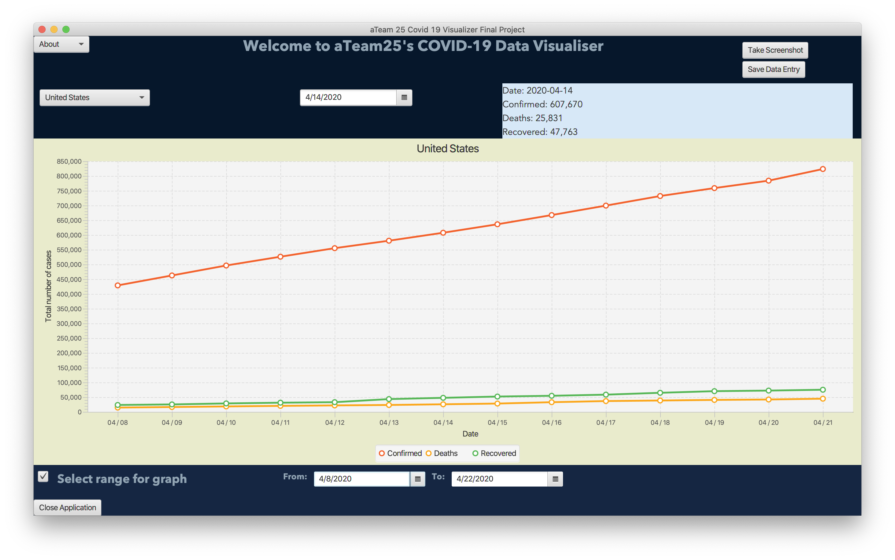
(If you want to view larger images of the program, right click an image and open it in a new tab please)
How to run the program
If you are interested in learning more and trying the program out for yourself, click here to view the GitHub repository, and click here for the release (the release link will give you a zip download of just the necessary files to run the program). Once you download the release.zip (click release.zip after clicking the release link above), unzip it and go into the unzipped folder. There from a terminal you can run the command ./covid-19-visualizer.sh. For more information about interacting with the program, please refer to the readme on the GitHub repository (first link in this paragraph). If you want to run the program from a Windows machine, the shell script will not work in the default command prompt. If you have java installed on your machine, your should be able to run the command java --module-path "javafx-sdk-11.0.2/lib" --add-modules javafx.controls,javafx.fxml -jar executable.jar, but I have not personally tried this on a Windows computer yet.

Drew Halverson
Software Engineer at Google, Ex Palo Alto Networks, Ex Amazon